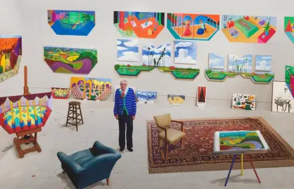
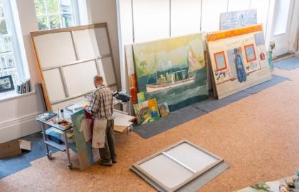
We often think of color as a matter of preference — “I like blue” or “I’m not into red.” But color goes deeper. It affects how we feel in a space, how we perceive objects, and how we connect with artwork emotionally.
In this blog, we explore how the psychology of color plays a role in art buying and interior design.
In this guide, we’ll break down:
The emotional impact of key colors
How to choose art that matches a mood
Using color to guide interior energy
Common mistakes when matching art to space
Color tips for collectors and decorators
Here’s a quick breakdown of what some common colors evoke:
Blue – Calm, trust, clarity
Red – Passion, urgency, warmth
Yellow – Optimism, energy, creativity
Green – Balance, peace, nature
Black – Sophistication, depth, mystery
White – Purity, space, minimalism
Purple – Royalty, introspection, magic
Think about what you want your space to feel like — and choose art that matches that emotional tone.
Each room in your home serves a different purpose — and your art should support that.
Living Room: Warm tones and inviting palettes
Bedroom: Soft blues or earthy greens for relaxation
Office or Studio: Energetic yellows or bold contrasts to spark creativity
Hallways or Entryways: Statement colors like red, gold, or black to grab attention
Sometimes, you want harmony. Other times, contrast creates visual tension in a good way. Use color in art to:
Soften bold furniture or walls
Add a focal point to neutral rooms
Tie together unrelated colors in a space
Choosing art just because it “matches” your sofa
Using too many dominant colors in one room
Ignoring how natural light changes color perception
Forgetting the wall color when choosing art tones
Pro tip: Test your artwork in the space before finalizing. Lighting changes everything.
Over time, you may notice your art collection leans toward certain colors — and that’s okay. It becomes part of your visual identity.
Build series around colors (e.g., a “blue wall”)
Shift tones as seasons change
Use color to tell a story from room to room
Color isn’t just about aesthetics — it’s about emotion. When you understand color psychology, you buy art more intentionally and decorate with purpose.
Whether you want a serene bedroom or an energizing workspace, color helps get you there.
“Colors, like features, follow the changes of the emotions.”
— Pablo Picasso
Explore our curated collection by color, emotion, and mood — and find the piece that feels just right for your home.
👉 Browse Art by Color →
👉 Ask for a Color Match Consultation →